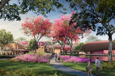
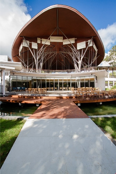
SIRIRAJ PIYAMAHARAJKARUN HOSPITAL
Bangkok Noi District, Bangkok
Thailand
2013
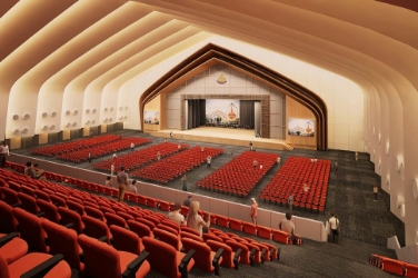
SIRIRAJ PIYAMAHARAJKARUN HOSPITAL
Bangkok Noi District, Bangkok
Thailand
2013
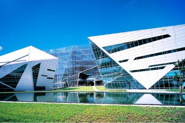
SIRIRAJ PIYAMAHARAJKARUN HOSPITAL
Bangkok Noi District, Bangkok
Thailand
2013
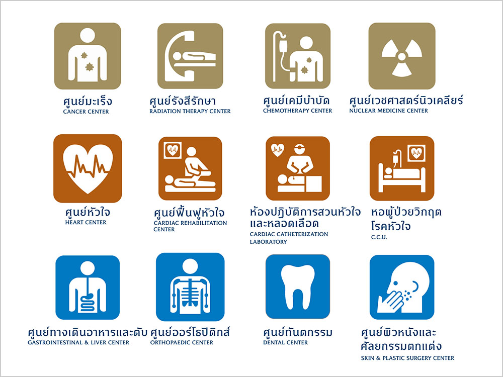
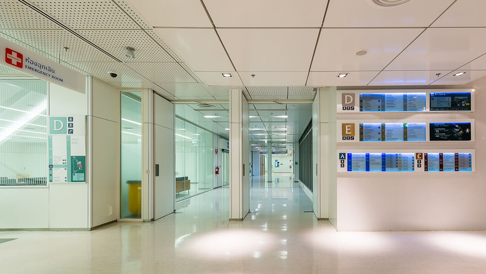
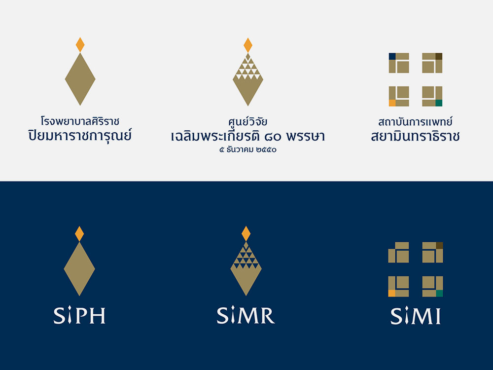
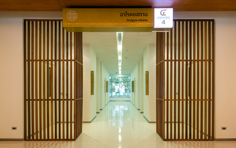
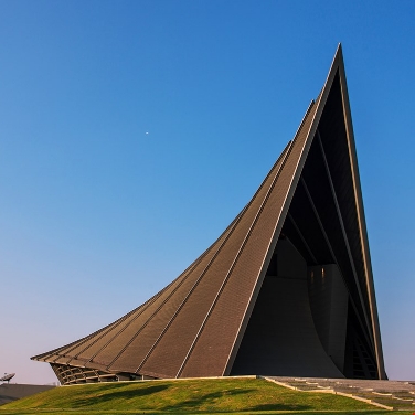
The concept of the design to symbolize the brand. Siriraj Piyamaharajkarun Hospital. From Royal grace with Institutions of knowledge, To excellence. In the design of brand and identity for new and modern hospital as part of a project to develop Siriraj Medical Excellence in Southeast Asia, it must be easily recognizable. Chosen is simple shape of a trapezoid. The attenuation of the shape of Phra Maha Pichai tiara as the robes of kings and princes in the Chakri dynasty. Since name bestowed upon hospital is King Rama 5, and seal also symbolize Lord Rama 9 and Praboromarajchanok the founder of Mahidol University. Thus the origin of this shape is not only the pride, but also represents a profound loyalty. To the benevolence and grace origination of Siriraj Piyamaharajkarun Hospital . Color Palette of golden yellow and deep blue inherited form Siriraj Hospital and Mahidol University identity. Blue is the color that represents the royal family. Gold is used as a base for the honor. And on top of the trapezoid is comparable to the peak of the tiara. Which is the same shape but smaller in yellow. The meaning of the color of his reign king rama 9. Meanwhile, when looking at the overall shape. Likened to crystal crown with shining pinnacle waiting to lighten the sky brilliantly. This Comparable to the excellence await to be dispersed and commitment to be the donor and recipient, the main purpose of public hospital. The design include family of logos for other builidngs and institutes within the same architectural design mission and vision of project. Initial logotypes in substitution to be more universal are also provided. Thai Typography for universal functions Letters (Font) of project for corporate identity system need to be use further for signage system. By working with typographer Ekaluck Peanpanawej to create new unique character. The new Thainess is developed without too small detail. By maintaining the correct proportion of Thailand characters , no head as decapitated in Pali shown in badge of the Mahidol University, but additions of more international friendly round-shaped to give good positive space and easy to read. Resulted in identity and fulfilled the sake of production of signs not to produce and install the small parts. Universal Pictogram set for hospital in Thai Identity Intended to create a set of symbols (Pictogram) and used to communicate within the hospital especially on the sign and symbol of building. It is a universal concept and to make it friendly, easy to understand, quick relaxation communication to the users. By adapting universal